Over the long weekend, I had some time to improve this blog. Because the blog serves as my written memory, I need to quickly find my notes and be able to read them. Thus, you may have noticed that I manually improved some of the converted blog posts and fixed the code formatting. Some old articles had HTML markup applied to individual characters and lines which screwed up the automatic conversion of my blog. I also fixed up some blog posts with embedded photos or videos, like Impressions from Zeppelin flight or 50 Years of IBM Mainframe: The Art of Selling. Not all is fixed for sure. If you find an article that needs to be improved, let me know.
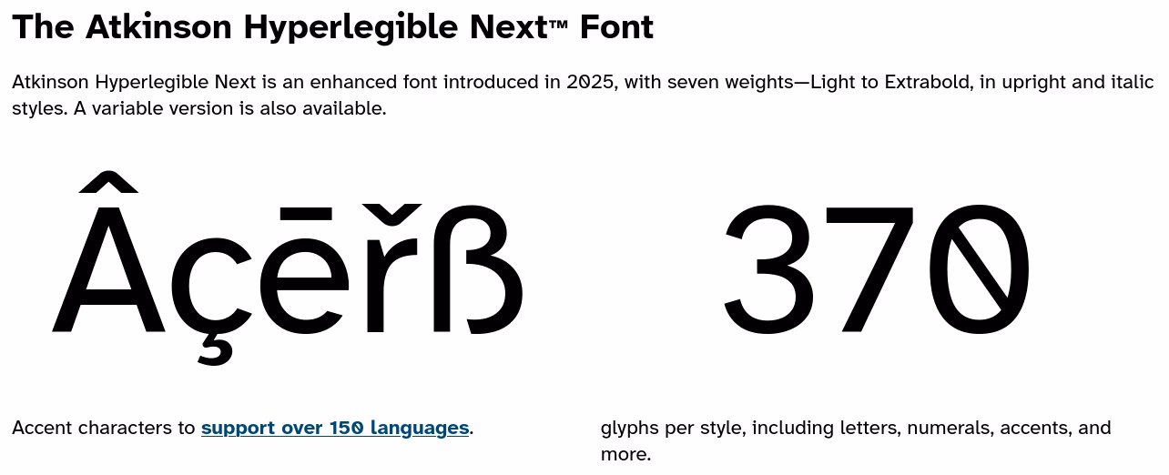
Braille Institute’s Atkinson Hyperlegible Fonts
Improvements to readability is also the reason for another change. I switched the blog to directly served Atkinson Hyperlegible Next and Atkinson Hyperlegible Mono fonts. They are a project of the Braille Institute of America to improve legibility and readability for individuals with low vision. Do you notice the changes? How is the legibility and readability for you? I tested it locally, showed it around, and rolled out the changes…
